 | Vol 1., No. 10 August 22, 2023 Scott Clearwater, Gridmetrics, Inc.® s.clearwater-c@gridmetrics.io |
The Gini index is often used to measure income equality. However, using PENS resilience indexes we can also apply the GINI methodology to look for inequality with respect to those measures as well. By combining these two Gini measures, income and power resilience, we can see if there is a correlation between income (in)equality and power resilience (in)equality.
The income Gini was derived for a metro area using the IRS population-weighted AGI (Adjusted Gross Income per household) data from 2019 for each zip code in a metro area. For each of the seven AGI income levels ([$0-$25k, $25k-$50k, $50k-$75k, $75k-$100k, $100k+) the mid-point was chosen as the income for that level. For the highest level of more than $100,000 the level was set at $200,000.
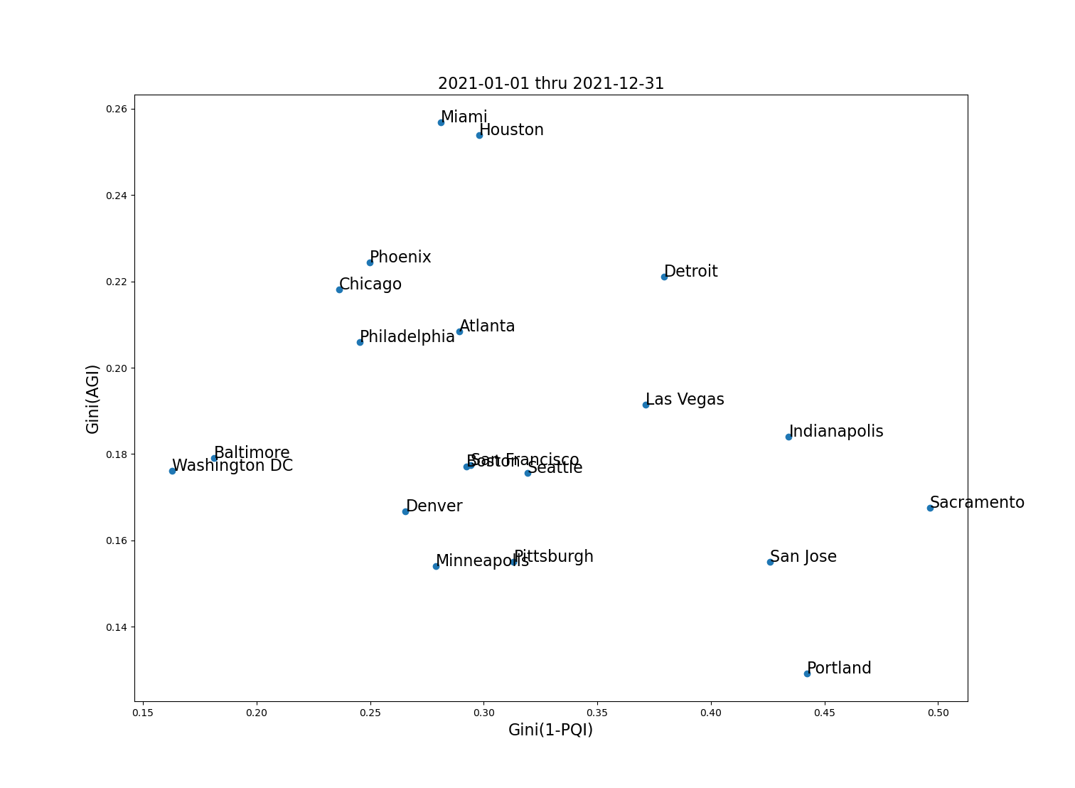
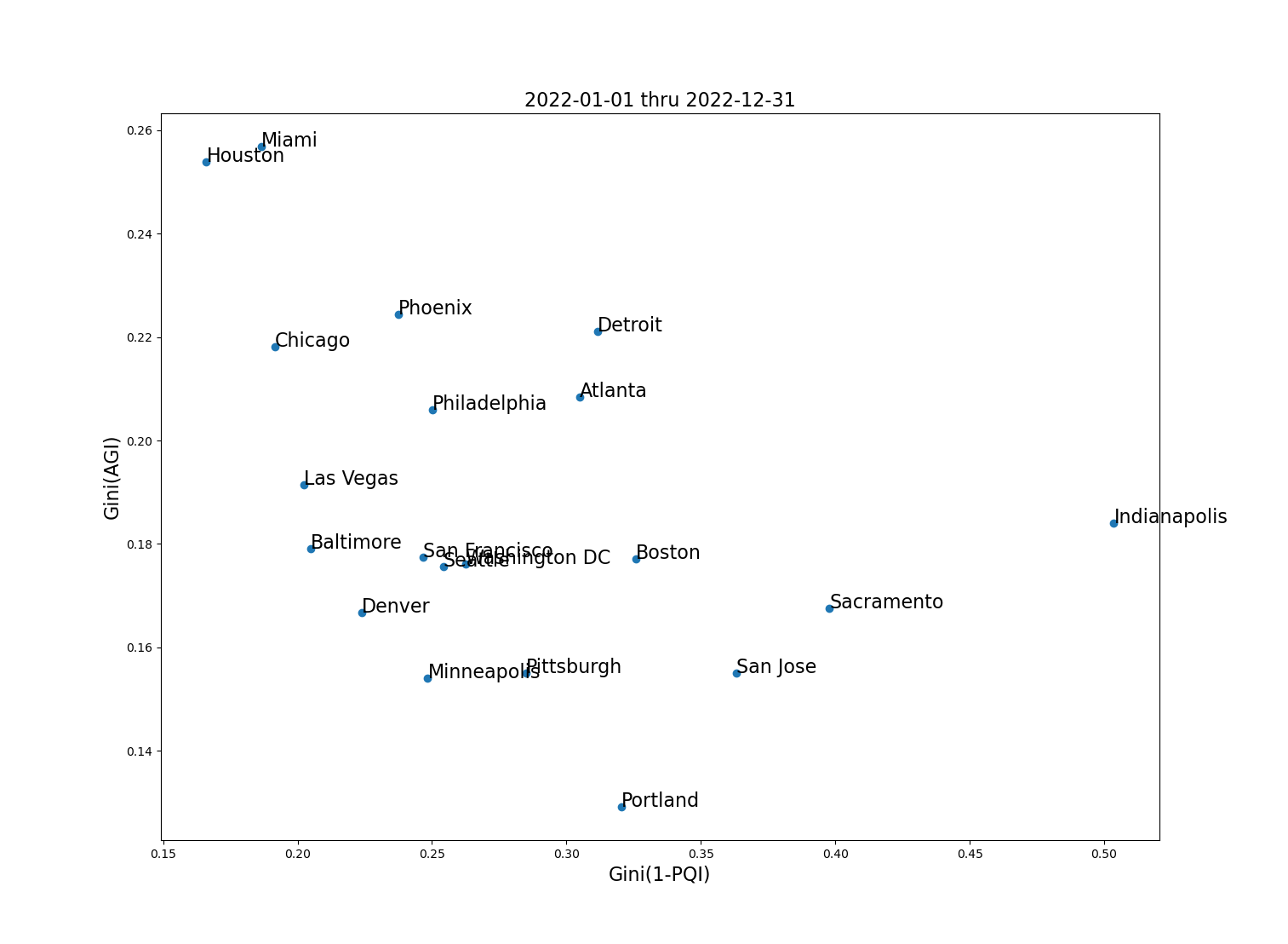
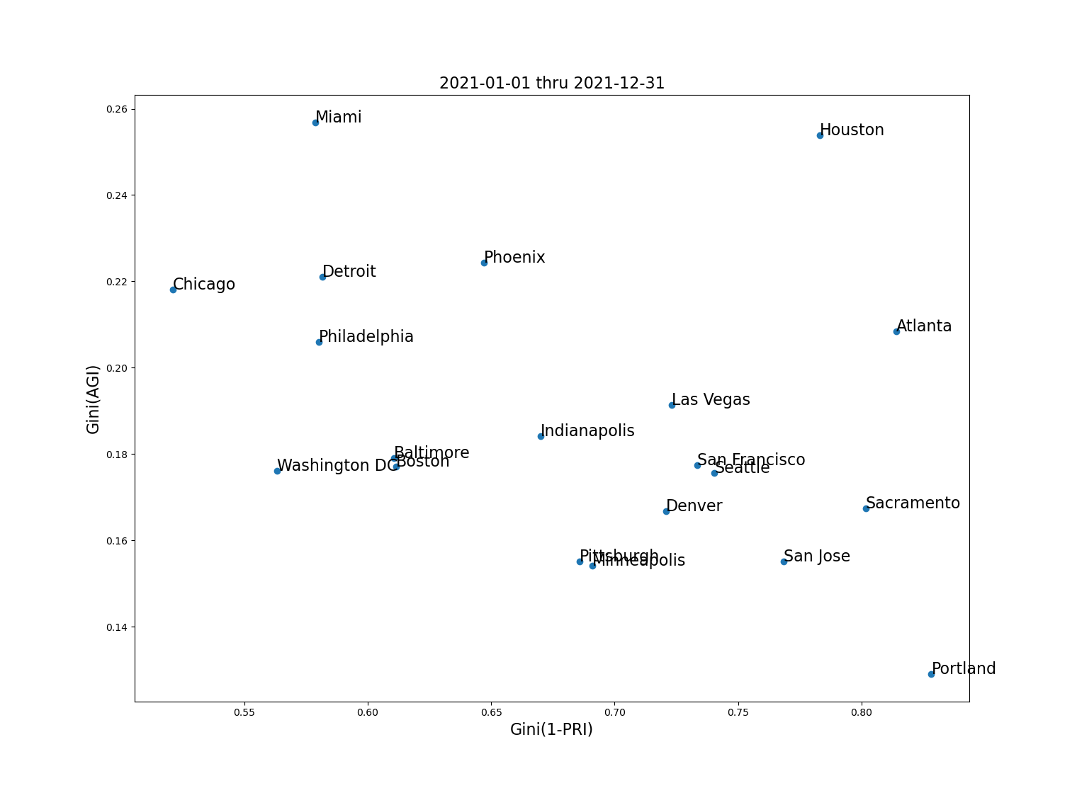
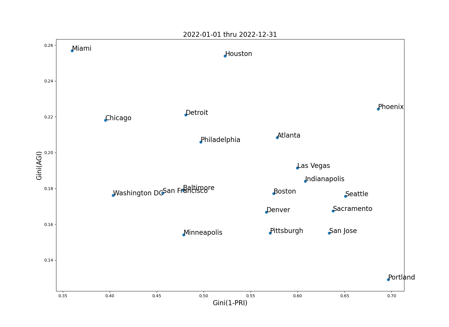
The figure below shows the Gini( AGI ) and Gini(1-PXI; X={Outage, Reliability, Quality}) for 2021 and 2022. Recall that we use 1-PXI because PXI is nearly 1 so that 1-PXI has a wider dispersion of “non-resilience” which makes for easier comparisons. The AGI Gini values do not change in this analysis because the income data used was the same in both years and probably did not change much anyway over the course of only two years. Points toward the lower left are lowest in income (AGI) inequality and power non-resilience, while those toward the upper right are highest in these measures. Houston and Miami score poorly on income inequality but in 2021 Houston also fared very poorly because of weather-related events, while Miami did well on power resilience equality in both years. Portland does very well on AGI equality but very poorly on all measures of power resilience equality in both 2021 and 2022. Overall there does not appear to be a correlation between Gini(AGI) and GINI(1-PXI) at the level of metro areas.
 |  |
 |  |
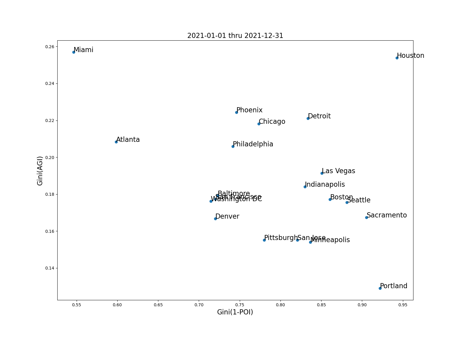 | 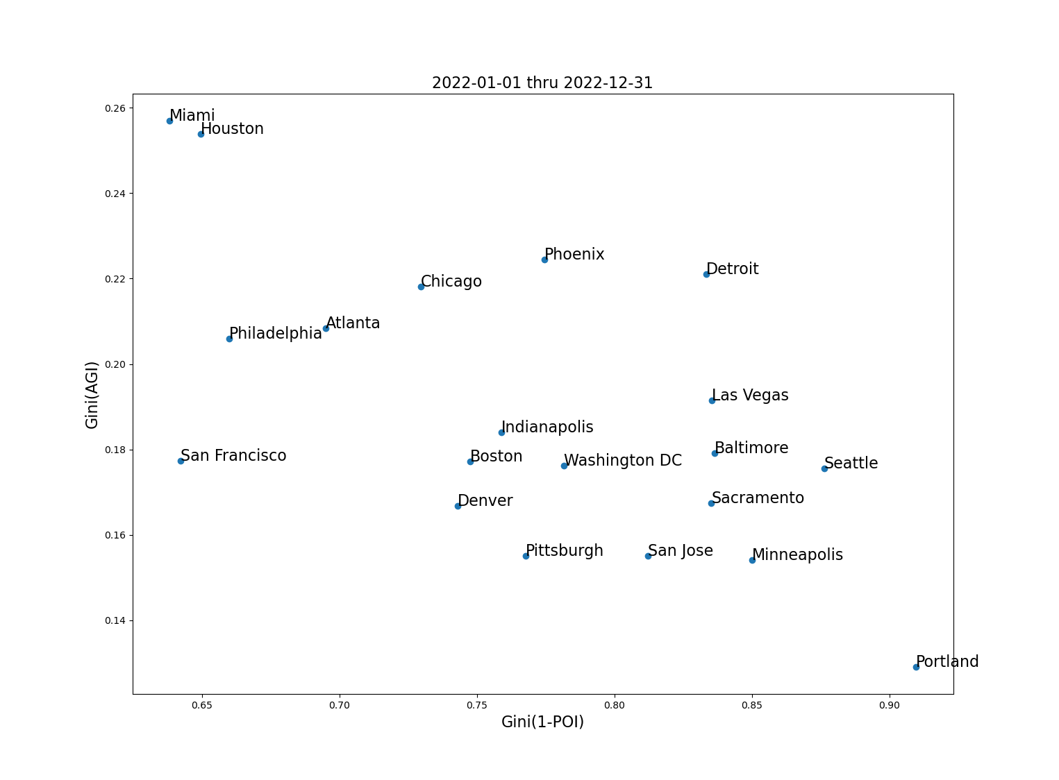 |
Fig. 1 Gini(AGI) vs. Gini(1-P{QRO}I) for twenty metro areas.
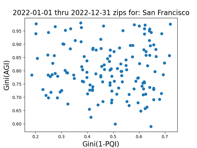
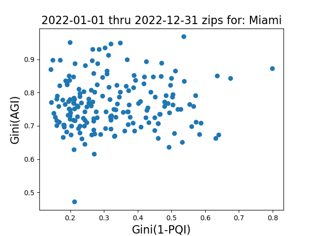
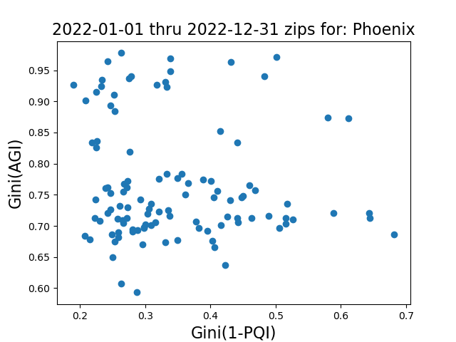
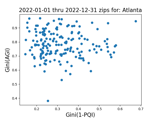
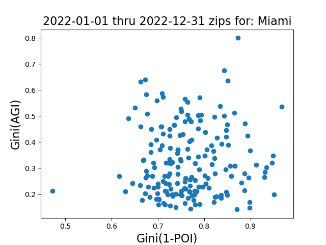
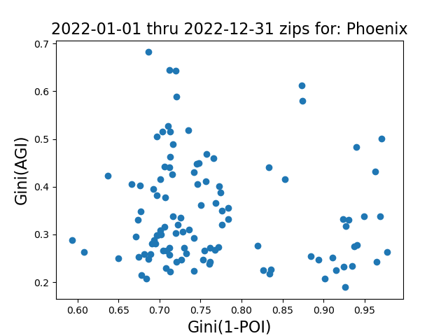
However, the above results beg the question whether there are correlations within a particular metro area and we explore this next. For this analysis we look at the weighted-AGI as before but this time calculating the Gini within each zip code—which is the resolution of the AGI data. Accordingly, the Gini for the power non-resilience will also be calculated over the same zip codes aggregated over a year, in this case 2022. The results are shown in the figure below for selected metros. As with the analysis over different metro areas there is no apparent correlation between the two Ginis within a metro area. San Francisco is a good example of this where the two Gini values are fairly uniformly distributed in both dimensions. Of course, there are outliers. For example, Miami and Atlanta have a zip code with high Gini(AGI) and high GINI(1-PQI) (towards the upper right of the scatterplot) which indicates high inequality in both income and power quality. But, they also have a zip code that has low Gini in both dimensions (lower left dot in figure) indicating high income and power equality.
 |  |
 |  |
Not only does the Gini of 1-Power Quality Index show no correlation, the same is true for power outages as shown in Fig. 3 for the same metro areas as in Fig. 2.
|  |
 |  |
While this limited analysis indicates there is not a systematic correlation between power non-resilience equality and income equality at the aggregated metro area, the analysis was able to clearly identify outlier metro areas. Further, the same analysis done at the zip code level within metro areas was also able to identify zip codes that do suffer most from income and power non-resilience inequality. This capability is unique to Gridmetrics data and allows for targeted remedies to the areas most in need, thereby avoiding a possible massive and unnecessary expenditure by a utility that would be passed on to all rate payers.
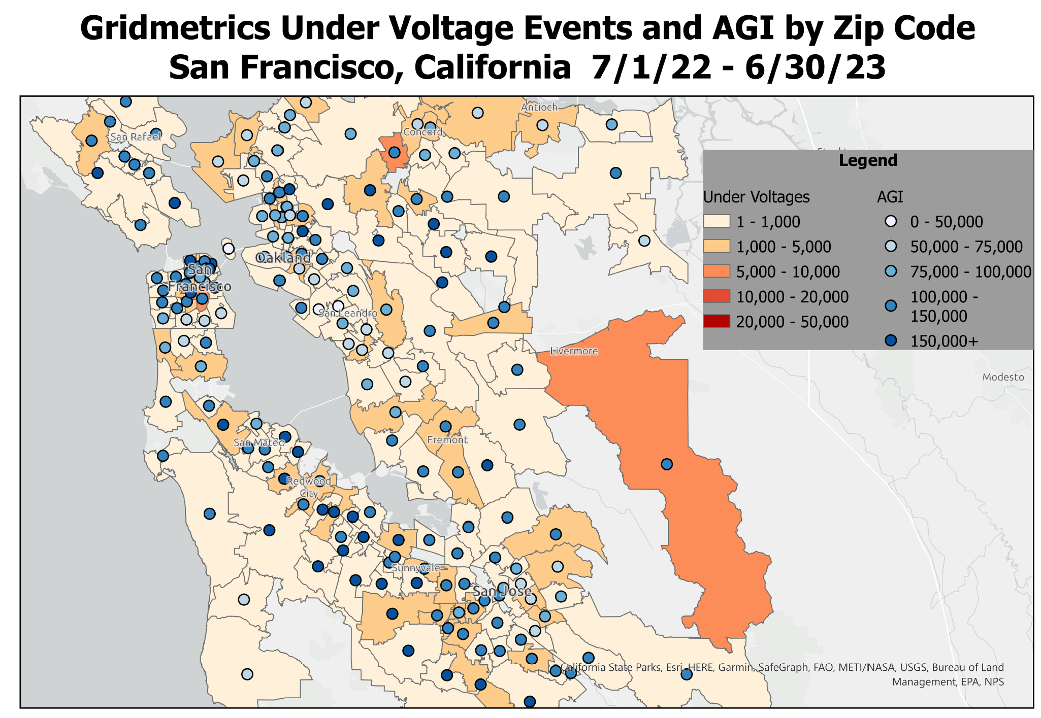
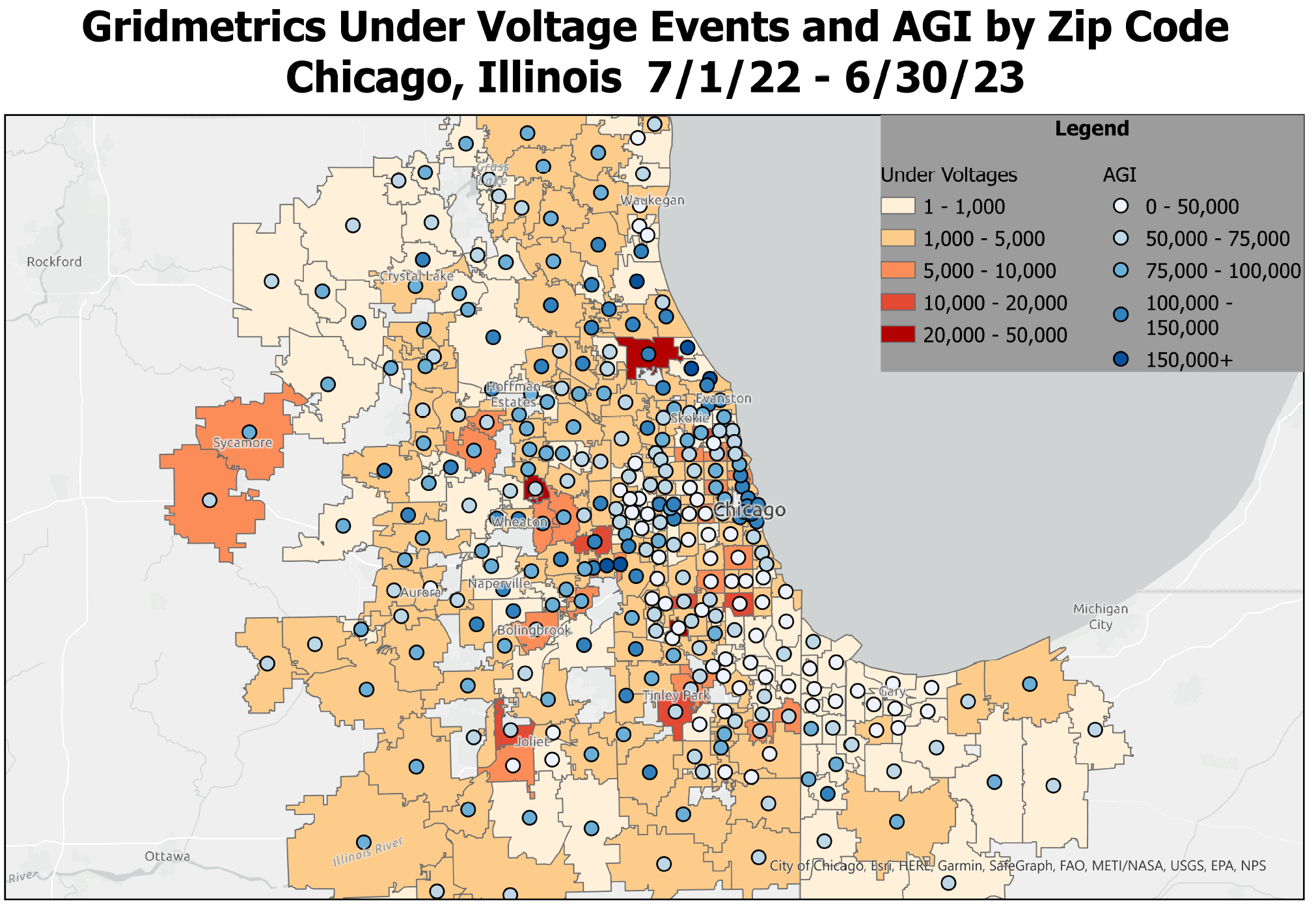
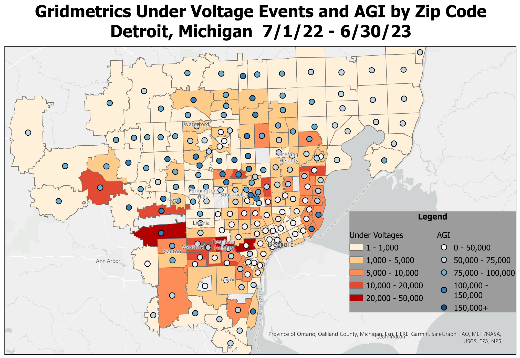
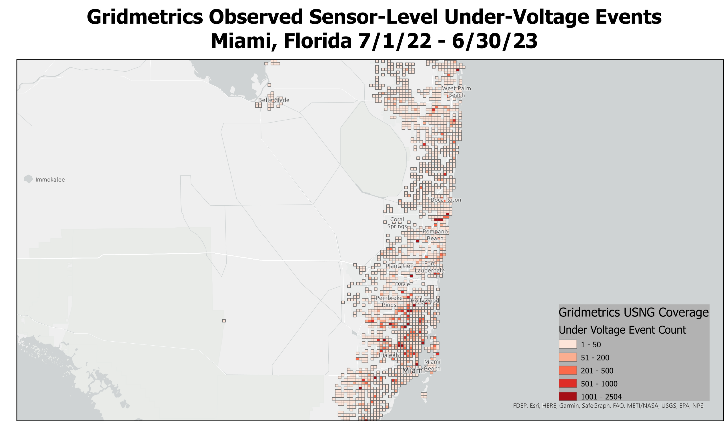
Next, we explore a geographical representation of under-voltages and AGI at the level of zip codes. This is a direct calculation not involving Gini. This is shown in Fig. 4. The color of the zip code areas gives a range in the number of under-voltages in a particular zip code and the circle gives the population-weighted average of the AGI. This kind of graphic shows how Gridmetrics can identify specific regions that stand out in voltage events and income.
Fig. 4 shows a map from different metro areas with their under-voltage counts and average AGI (population-weighted by mid-point of AGI level). This capability is unique to Gridmetrics. For San Francisco there are no obvious correlations between under-voltages and average AGI. For Chicago note that the worst outage area also has a fairly high average AGI. For Detroit the highest outage areas include both high- and low-income areas. In the Miami area the worst under-voltages occurred in lower-income areas.
 |  |
 |  |
In summary we have shown that within the Gridmetrics coverage area there appears to be no correlation between income levels and various measures of power resilience equality as measured by the Gini coefficient. The analysis was able to show there are outliers that can be targeted for remedial action to bring their power resilience more into line with surrounding areas.
Learn more about Gridmetrics actionable power intelligence solutions.