 | Vol 1., No. 3 March 29, 2023 Scott Clearwater, Gridmetrics, Inc.® s.clearwater-c@gridmetrics.io |
Would college football fans want to see the highest scoring team be rated #1 independent of its win-loss record? Doubtful. In this article we will look at a tournament-inspired scheme for ranking different localities by power resilience. In tournament scoring of competitions, it is not just the win-loss record or total points that determines the overall ranking. The ranking also depends on who was beaten and by how much. Thus, a blowout win over a weak opponent may be less important to the rankings than a small loss to a powerful opponent.
Why bother with this extra layer of complexity for power resilience when a simple overall score such as total hours of outage or under-voltage is available? Because tournament scoring takes into account how each region performs relative to all the others on a day-to-day basis. In other words, the tournament scoring takes into account the distribution and magnitude of scores versus other locations (like “teams”). Using just a sum or average of some measure completely obscures this useful information.
As applied to power rankings, or maybe it should be called “power-power” rankings, each day there is a power score for each locality. The power score could be based on a number of voltage events per sensor or the Gridmetrics Power Quality Index, PQI, etc. In this particular case the score for a region is the sum of all the voltage events (outages, under- and over-voltages) divided by the number of sensors in that area divided by the sum of that quantity and that quantity for another region. Since power outages are worse than under- or over-voltages, power outages are given a weight of 3 and under- and over voltages a weight of 1 and severe under- and over voltages are given a weight of 2. For example, if the there was two sensors and 1 power outage and 3 under-voltages for region 1 then the score for region 1 would be f1 = (3⨯1 + 1⨯3) / 2 = 3. Now suppose region 2 has three sensors and 2 under-voltages and 1 severe under-voltage, then its score would be f2 (1⨯2 + 2⨯1) / 3 = 1.333. Finally, the score for region1 with respect to region 2 is s12 = f1 / ( f1 + f2 ) = 3 / 4.333 = 0.692; s21 = f2 / ( f2 + f1 ) = 1.333 / 4.333 = 0.308, and so on for all the other regions. Whichever area has the lowest score has “beaten” the other area for that day. Summing these scores over the course of 2022 gives us an overall scoring matrix. A ranking algorithm, in this case the Keener algorithm, was applied to come up with the final rankings. (See, for example, “Who’s #1, the Science of Rating and Ranking,” Amy N. Langville and Carl D. Meyer, Princeton University Press, chapter 4, pp.29-52 (2012).)
As an example, we look at the number of power events for all the counties in California in the Gridmetrics coverage area and that have at least 50 sensors. This gives us a “league” of 33 counties. In general, we are not limited to looking at counties within a state and almost any desired partitioning could be accommodated down to regions of 1km x 1km size. Here power events (power outages, under- and over-voltages) are bad things so the low score of the number of these events wins. Here are the best and worst five counties for 2022 “season” using weighted tournament scoring and the weighted sum of events.
Table 1. Ranking for 5 Best and Worst California Counties in 2022 for Power Resiliency
| Rank | Tournament | Sum of Events |
| 1 | Placer County | Placer County |
| 2 | Yolo County | Stanislas County |
| 3 | Nevada County | Sacramento County |
| 4 | Calaveras County | Orange County |
| 5 | Tuolumne County | Mendocino County |
| Rank | Tournament | Sum of Events |
| 29 | Orange County | Kings County |
| 30 | Fresno County | Monterey County |
| 31 | Contra Costa County | Madera County |
| 32 | Santa Clara County | Calaveras County |
| 33 | Alameda County | Santa Cruz County |
The remarkable thing to notice is that the two scoring methods have very little in common for the best and worst counties. In fact, two counties are on the top 5 by one scoring method but in the bottom 5 for the other scoring method (Calaveras and Orange Counties).
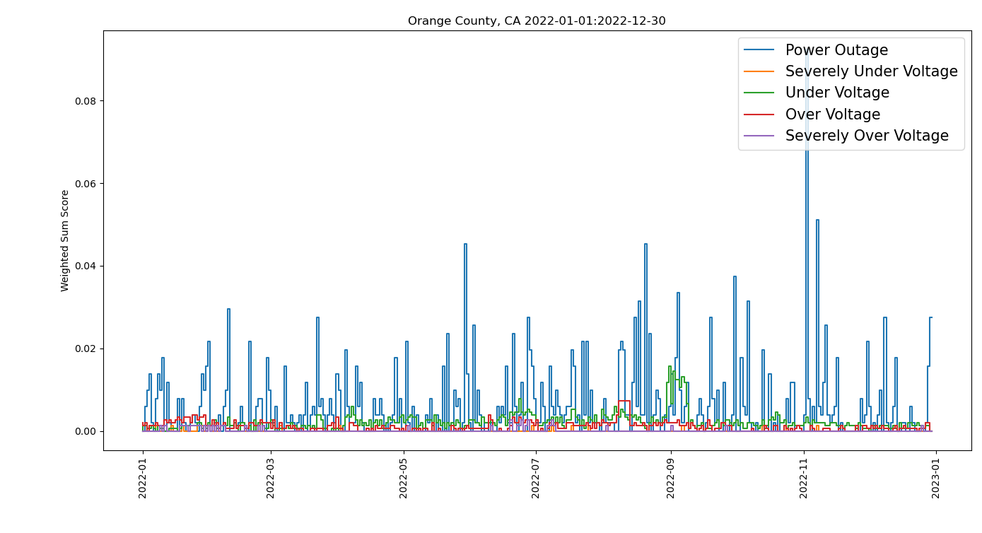
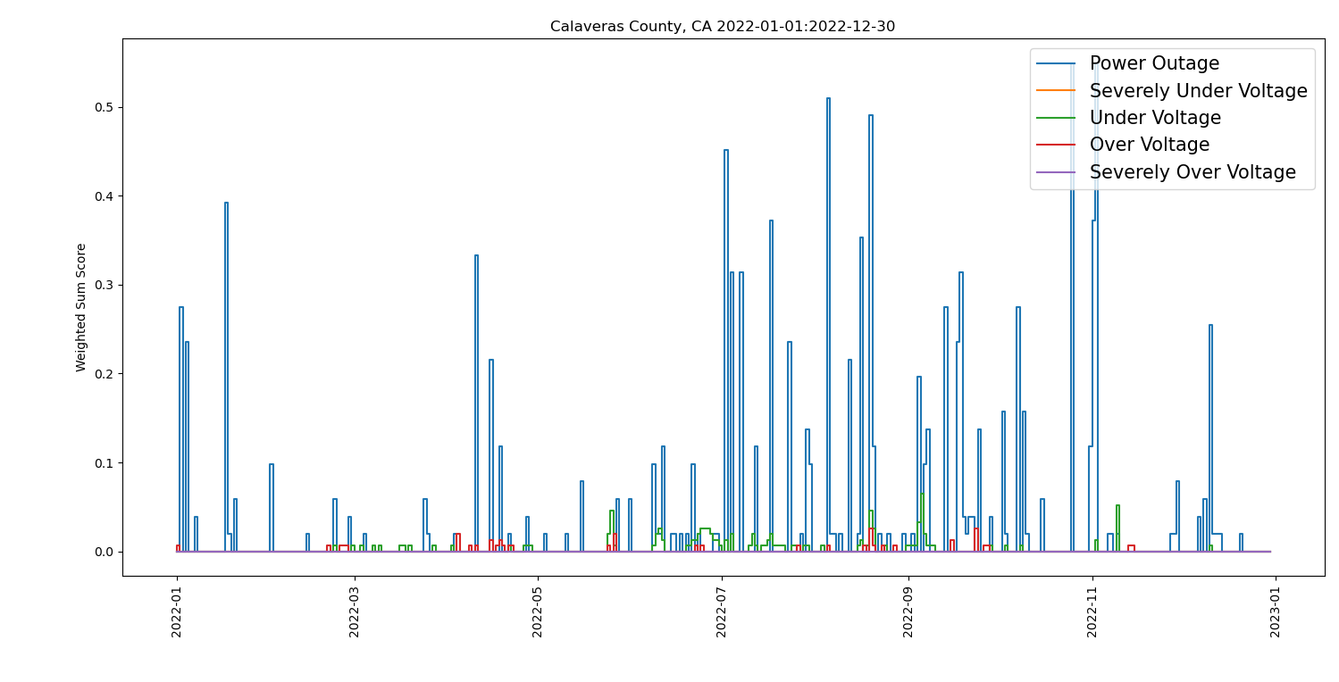
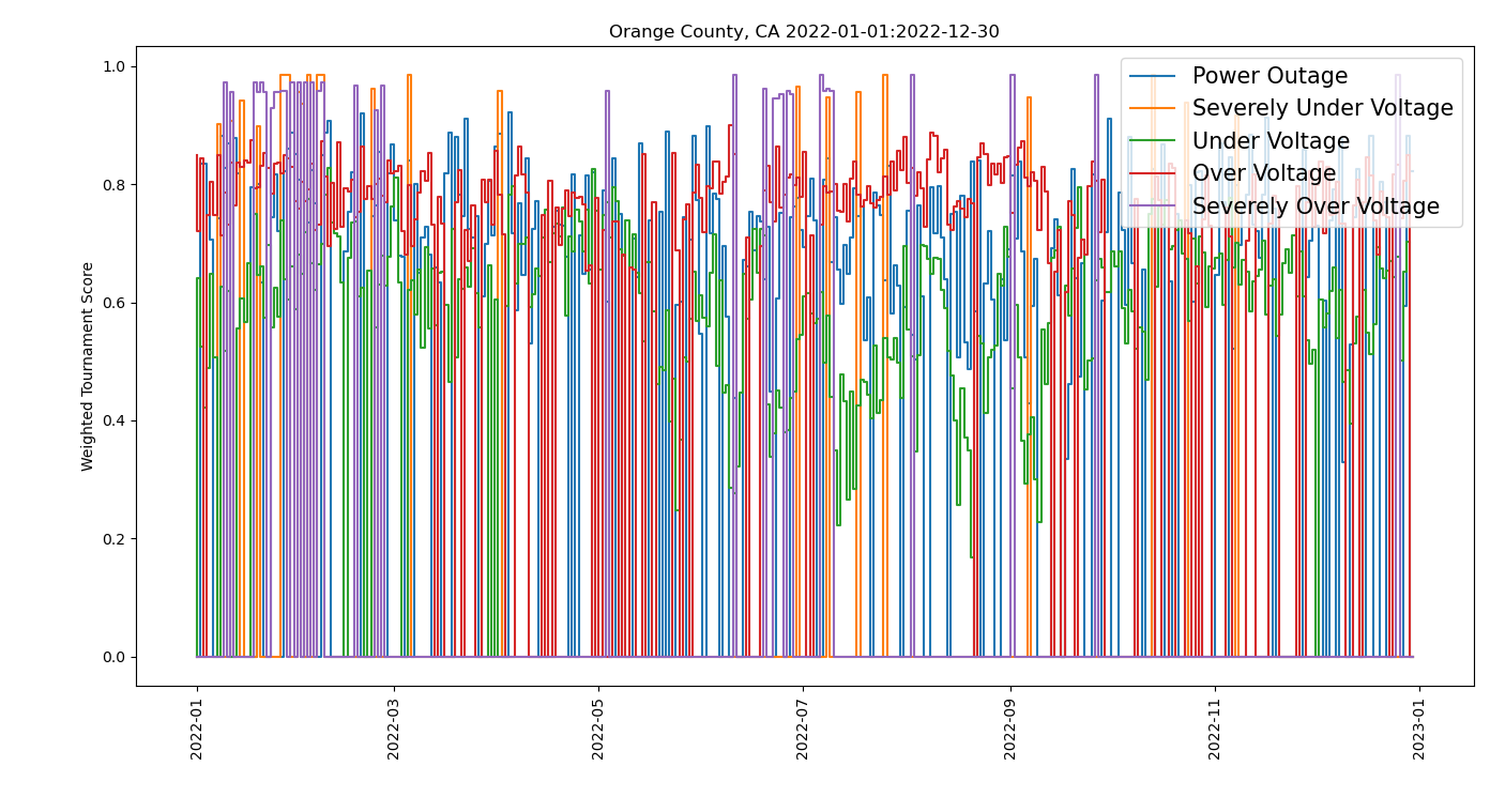
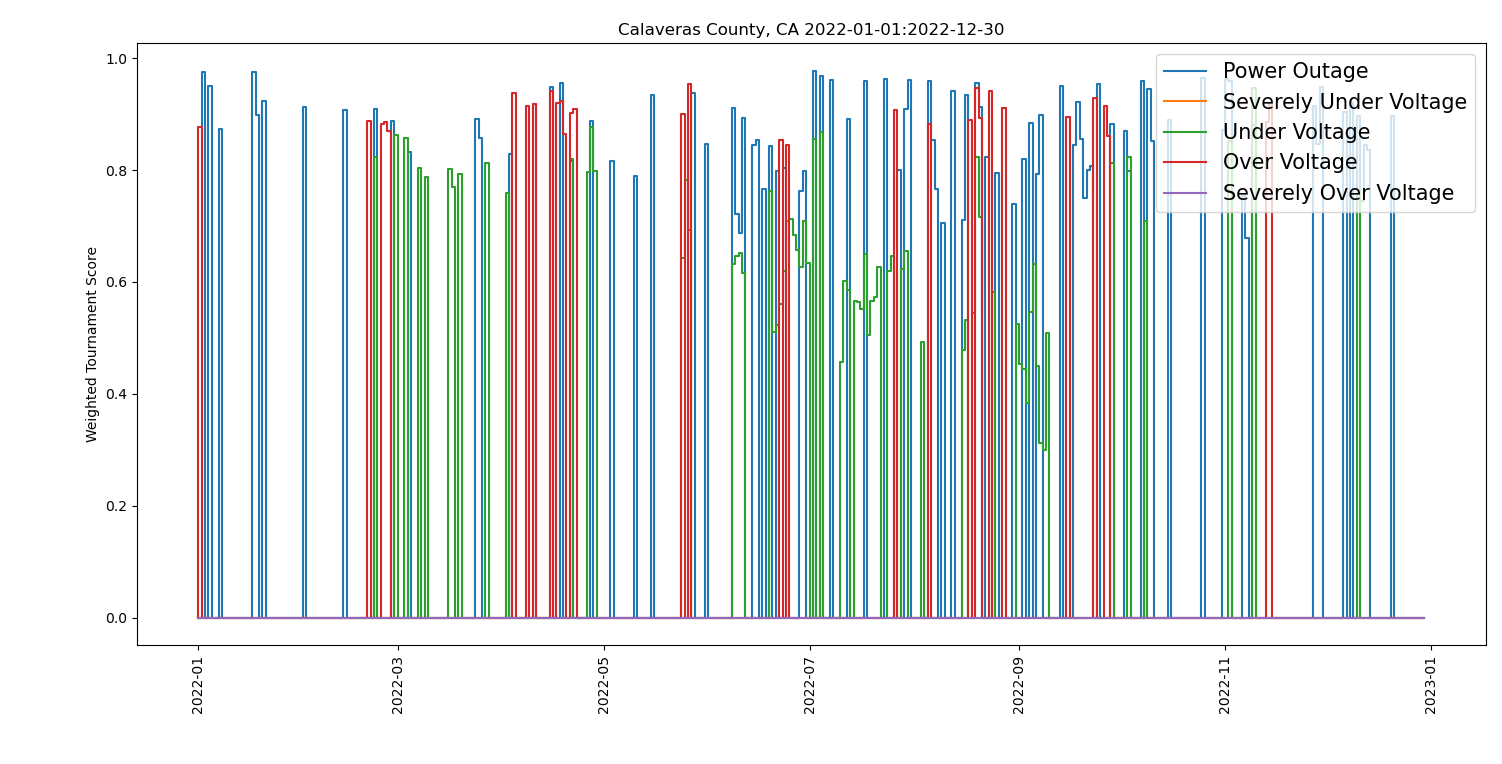
We can understand these differences by looking at the table below for Orange and Calaveras Counties. On the top row we have the weighted sum score for Orange County (top left) and Calaveras County (top right). While it looks like Orange County has more events, looking at the vertical scales shows that these scores are much lower than for Calaveras County by almost a factor of ten, hence Calaveras County ranks much worse than Orange County by the weighted sum score method. The bottom row shows the weighted tournament scores. Note that Orange County (bottom left) has many more events of high magnitude than Calaveras County (bottom right), hence it ranks lower than Calaveras County using the weighted tournament scoring.
 |  |
 |  |
Differences across scoring methods can result in “good” being “bad” and vice-versa. The lesson here is that who is good or bad depends very much on the method of scoring. Thus, the scoring method employed in ranking entities has important implications for allocation of resources by decision-making authorities to upgrade seemingly underperforming areas.
Learn more about Gridmetrics actionable power intelligence solutions.